White House is Completed on Site Residential
The White House is a high profile residential project located close to London’s famous Tower Bridge. The project consists of the refurbishment of a 1980’s 4 storey terrace house, part of larger complex.
The 4 storey terrace house, with its long narrow plan, and a pastiche, yet simple white envelope is a typical example of a “classically” inspired/influenced London architecture of the 80s where under the supervision of Prince Charles, the new structures had to match the scale of their surroundings and the “grandeur” of classical times. The design intention for the project, or the brief itself, is not about mimicking that specific 80s style for the interior, but rather contrasting it in an elegant and expressive way.
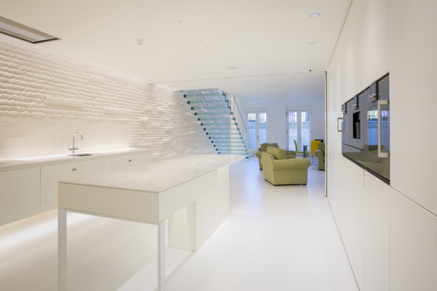
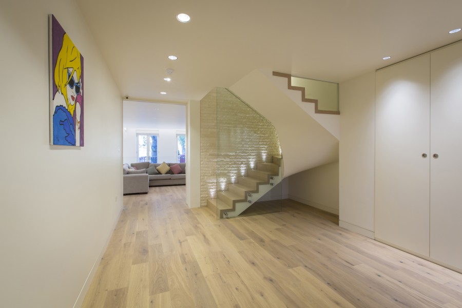
Programmatically, the floor plans stayed the same as the existing, with the kitchen and living areas on the Lower Ground Floor, Study and Lounge on the Ground Floor and Bedrooms on the First and Second floor.
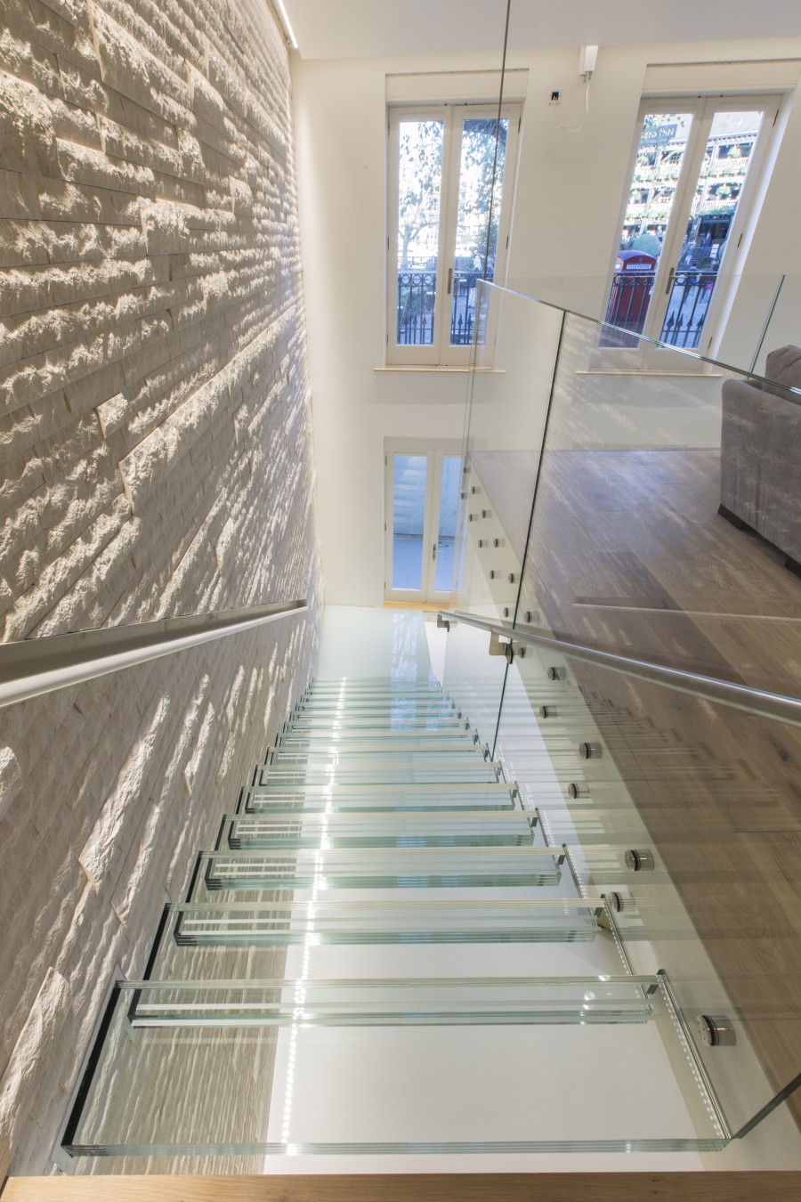
As the floor plan is long and narrow, a void was cut into the ground floor plate/slab to ensure that natural light spills throughout the interior and now a newly formed double height space connects the kitchen/living area with the study and the lounge. Consequently, a glass staircase is added to emphasise the new connection between lower ground and ground floors and also contrast the existing circulation, which occurred only via a centrally positioned staircase providing a vertical to an almost horizontal axis. The vertical, “closed“ stairwell is now contrasted/complemented by a long and “slow”, open glass staircase with views towards the dock. As a result of the new circulation intervention, the design brief is finalised with the space being organised around a choreography of movement and rhythm, of “fast” and “slow” routes, and not around the standard notion of stacked floors.
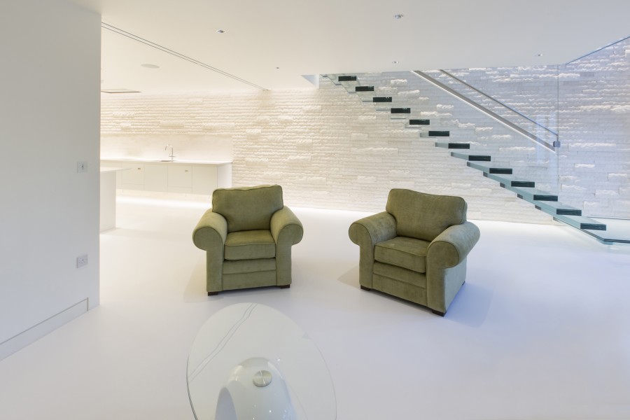
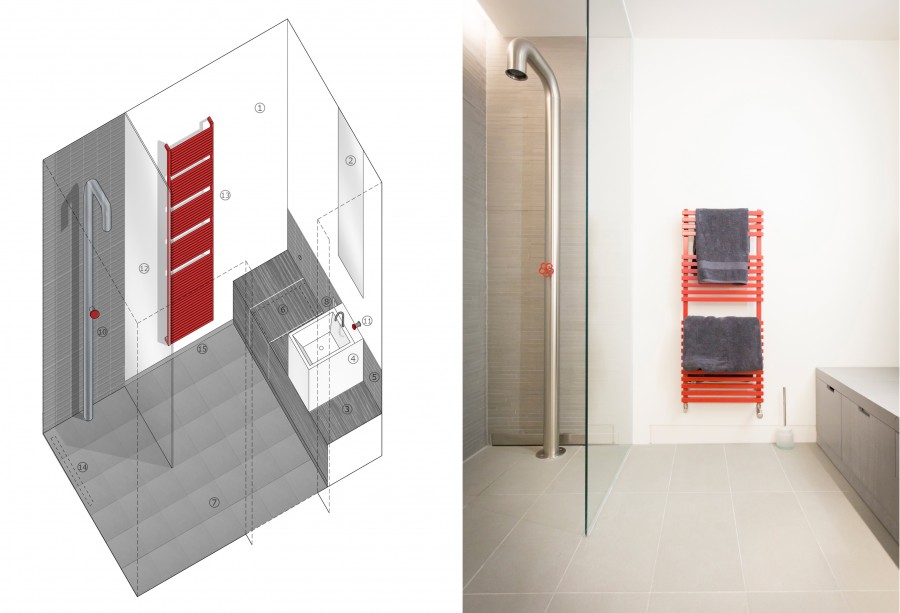
The material palette for the project is very neutral and follows the minimal, crisp, clean lines of the new kitchen and re-clad existing staircase. Instead of playing with different colours we decided to create a blank canvas with emphasis on texture. All the materials blend in seamlessly, characterised by an elegant and “eloquent” white-ness with the exception of the master en-suite where a concrete effect mosaic tile was selected for a more rough, industrial aesthetic. As the palette is informed by this concept of “choreography” two white natural stone walls – one vertical, one horizontal – are introduced to form the background for the new circulation routes, and along with the white resin floor they imply a certain continuity throughout the space. The double height natural stone feature wall (and glass staircase) can be glimpsed through the main facade windows from almost every point in the docks outside, making it the key design element/object of the refurbishment.
The clean, crisp lines and the elegant white-ness of seamless materials make this house beautiful and classic, without the formality of the 80s pastiche architecture.
November 2, 2014
